
Embryo’s word count study
This is the story of how Embryo embarked on the largest-ever study of how much content it takes to help you to rank in the top 10 of Google.
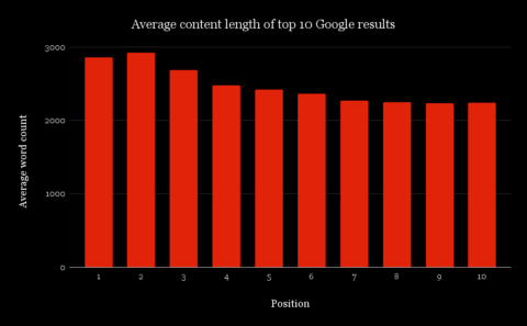
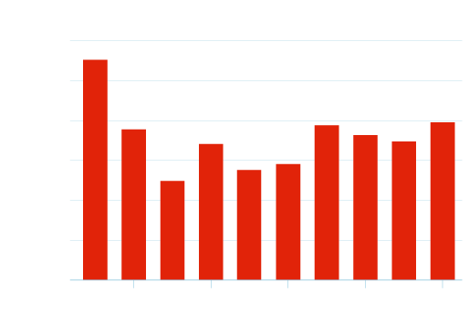
Before we get into the hows and whys, here is the data that most of you will be here for. This graph shows the average number of (meaningful) words on pages in the top 10 of Google results for over 20,000 keywords (24,774 to be exact).
Why did we undertake this content study?
The last meaningful data surrounding content length/word counts of pages was conducted by a company called serpIQ (now defunct). This was done way back in 2012, which meant that there had been practically a decade in which things may have changed. During these years, hundreds of companies – including ourselves – had used the serpIQ data to exalt the benefits of long-form content. So we felt that someone should commit to another study to see how different things were, if at all.
So, that’s what we did!
For those who prefer fix numbers, the table below shows the exact number of words for each position, as displayed in the graph above.
|
Position |
Average Word Count |
|
1 |
2855 |
|
2 |
2923 |
| 3 |
2683 |
|
4 |
2479 |
|
5 |
2422 |
|
6 |
2363 |
| 7 |
2267 |
|
8 |
2244 |
|
9 |
2230 |
|
10 |
2242 |
Why did we undertake this content study?
The last meaningful data surrounding content length/word counts of pages was conducted by a company called serpIQ (now defunct). This was done way back in 2012, which meant that there had been practically a decade in which things may have changed. During these years, hundreds of companies – including ourselves – had used the serpIQ data to exalt the benefits of long-form content. So we felt that someone should commit to another study to see how different things were, if at all.
So, that’s what we did!
How did we do it?
Well, it wasn’t easy, and despite initially thinking that we would do it annually, we will probably do it once every 2-3 years, such was the effort required.
Over the course of six months, we did the following:
1. Collected just over 20,000 keywords
We used ‘every day’ keywords as much as possible – things that typical web users search for, rather than solely ‘premium’, single-word keywords. There was a mixture of top-tier keywords, question-based keywords, and short, mid, and long tail variations. (We largely used the excellent SISTRIX for this).
2. Created our own crawling software
This allowed us to crawl SISTRIX’s API for the top 10 sites for each keyword (without SISTRIX kindly donating us lots of free API credits, this effort would have cost us a fortune, so a BIG thanks goes to the SISTRIX team).
3. Created our own word count software
This was by far the most complicated part of the whole study! We created perhaps eleven versions of this until we were satisfied with its output. We made sure the software ignored non-meaningful content e.g. menu text items. (This was one of the most difficult things that we have ever undertaken, code-wise).
So, with all those things in place, it took us around three months to collect all of the data, once we had got the keyword, crawler, and code in a place that we were happy with. Writing the software and code took around one month. So overall, four months were spent delivering the output that you are seeing in this report.
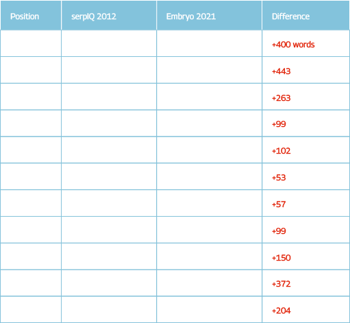
2012 to 2021 – what has changed?
Taking a look at the differences between what we discovered and what serpIQ reported, it seems that websites have evolved somewhat, as we have recorded that a greater amount of content appears on top 10-ranked sites than it did in the past.
From the table on the right, you can see that there is a general trend of a greater number of words appearing across pages that are in the top 10 of Google. However, we strongly believe that our own way of discarding non-useful text on a page probably means that there is an even greater amount of positive word count difference than there was in 2012.
This is something that we cannot prove, as we don’t have access to both sets of data. And, for all we know, the serpIQ word count software was as good as what we have created (but we doubt it!).
Our ‘gut instinct’ thinks that the difference in number of words (on average) compared to 2012 is closer to 400, rather than the 200 as the data has recorded.
Questions versus non-question queries
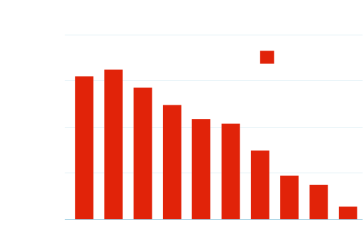
While knowing what the average number of word counts across all 20,000 keywords is interesting, we found that as we drilled down into more data, even more interesting and useful stats came to light.
For example, the graph on the left breaks down each keyword into two types – question and non-question, which was us simply checking for the uses of the words ‘why’, ‘how’ and so on in a query.
As you can see, for the top three positions, to help rank for a keyword that is question-based requires a lot less content than for a non-question-based query. One could assume that a page built around a specific question is likely to need less context surrounding answering the question.
So why is this? A high-ranking page built to target a non-question keyword phrase is likely to have much more contextual content on topics that surround the main keyword, helping Google to know that the people behind the website know much more than just the solution to a specific problem.
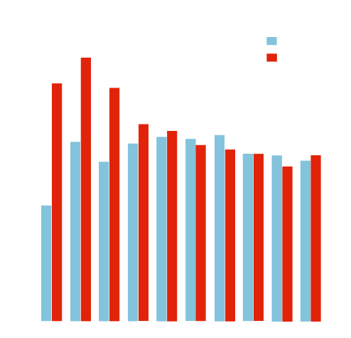
Word counts by number of words in query
Essentially, you could argue that for 3 to 6-word search queries, the content doesn’t have to be as long as for queries of other word lengths, as Google is likely to be able to ascertain with some certainty what the people using those queries are wanting to see. Single-word queries presumably have the largest amount of content per page, as the keyword users type in could have several meanings and intents, depending on each particular user. This means that more content is likely to be able to satisfy the user, as it has a higher chance of containing the content they are searching for than a page with a lesser amount of content.
However, for searches using 7-10 keywords, the trend is reversed, which we found to be particularly strange. Perhaps this means that as mighty as Google is, it isn’t yet able to fully understand queries of this length to the same degree that it understands more populous 3 to 6-word queries.
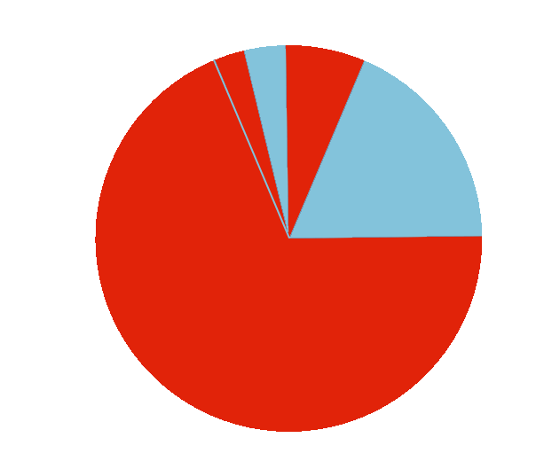
SERP features
As we recorded the data from the SISTRIX API, we were able to see which top 10 positions were taken up by various Google SERP features such as ‘People also ask’, inline videos, news items, jobs, inline Twitter items, and inline images.
We found that ‘People also ask’ (denoted as Question on the pie chart) appears much more than any other type of SERP feature, appearing for 68% of the times when a feature did occur.
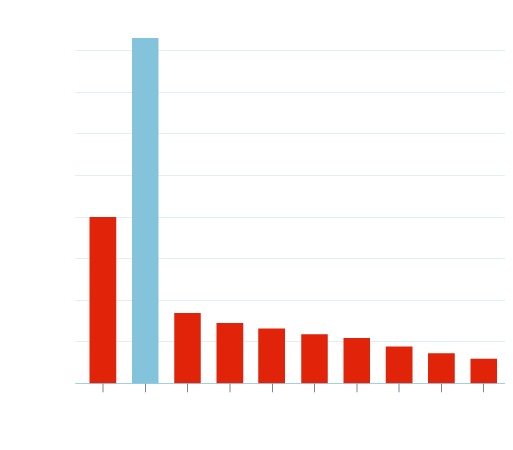
‘People Also Ask’ – where does this feature appear?
Another piece of really useful information to the SEO community (we feel) is of the placements of ‘People also ask’ features in Google SERPs. We haven’t previously found any useful data that shows at which SERP position these features are likely to occur, and especially not over a large dataset of 20,000+ keywords.
The graph to the right gives a clear indication that Google is much more likely to show a ‘People also ask’ feature in the first three organic positions, with organic position number 2 by far the most prevalent. We will let you decide why this is the case…
Analysing user’s search intent using SISTRIX data
One of the many useful parts of the SISTRIX toolbox is the ability to ascertain what kind of intent is behind a search, and is done with a confidence score of 0-100. This gives an SEO and/or content team extra ideas and ways to build content around keywords to attract the type of intent they wish users to have when visiting the site. This is just one of the ways that SISTRIX’s intent data can be used. You can find more about SISTRIX search intent on their website.
The graph to the left is a violin plot of the ‘visit’ intent, which is explained by SISTRIX as:
“These queries are very location-focused and might include ‘near me’ or ‘closest’ in the full search query. These searches often trigger the Google Maps feature in the SERP. Some search queries have implicit location requirements such “pizza” which is likely to require some location-based answers. In some cases, Google may deliver website and location-based results ,and there are always cases where it’s almost impossible for Google to know what the requirement is. Consider ‘Apple store’ for example.”
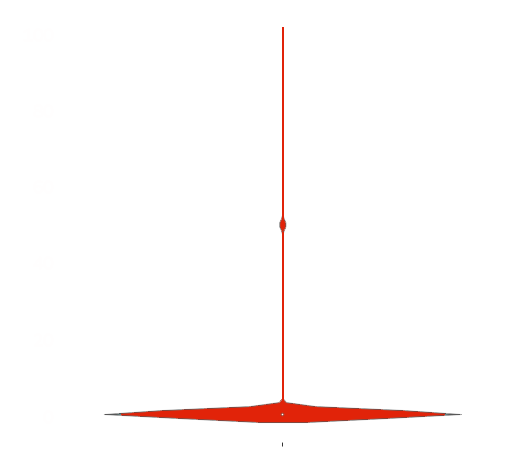
What the graph above is showing is that across the 20,000+ keywords that we processed, SISTRIX reported in the vast majority of cases that it was less than 10% confident that searches were with the intent of looking for a physical store. You can see two other small clusters (at around 50% and 100%) where SISTRIX was either ~50% or ~100% sure that these searches were looking for something that could be physically visited.
Summary
We did produce some more graphs from various data, but they cover really small edge cases, and probably won’t be that interesting to the majority of readers. At least we’re being honest.
So, after 24,774 keywords checked, we can concretely assume that there has been around a 10% increase in the amount of content on pages in the top 10 of Google compared to 2012. However, as we stated earlier on this page, we believe (but cannot prove) this to be closer to 400 extra words across each of the pages that have a top 10 ranking. We think this because of being able to remove much of the non-important text on the vast majority of websites we checked, using various advancements in our text-stripping tools. Until Google understands the contents of an uploaded video to a much, much higher degree than it does today, we expect the word counts of pages across the web to continue to rise.
At what rate, we don’t know.
Disclaimer: Content length on its own is not indicative of success. Content volume is just one factor that will help a site to rank well in any industry. However, across millions of websites across thousands of industries, sites that have more content than others are overwhelmingly more successful.
We must say a big thank you to Steve Paine of SISTRIX for his excellent help, allowing us to publish this data in a few months, rather than a few years! Coding and tool design: James Welch, Zahed Kamal and data visualisations: Danny Waites.


