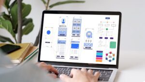
Designing websites for mobile is now an essential consideration of any business’ site-building process. In a world where mobile usage is only climbing most web designers have swapped their large screens for mobile and are designing for mobile-first functionality, optimising for the small screen making it a vital part of the design process with many moving away from a standard desktop design and concentrating on a fluid system for scaling sites for the many devices of today’s world.
The difference between a good and bad mobile design can usually be boiled down to the quality of the user experience (UX) strategy. A good UX strategy is what can separate a successful website from an unsuccessful one, with today’s customers expecting a lot for an MVP (Minimal Viable Product). All of this, and much more, is why UX is now considered an essential component of the design process and not just the afterthought it once was.
At Embryo, UX and User Interface (UI) have never been an afterthought and in the blog, we hope to explain a bit more about why designing for mobile should be your default position the next time you look to invest in, or create, a new online home for your business. Here, we’re going to run down five principles to consider as well as offer some insight into things you should absolutely avoid when it comes to this section of web design.
For more on our approach to websites, UX, and UI, be sure to get in touch with our team today by phone at 0161 327 2635 or drop us an email at info@embryodigital.co.uk.
Five things to consider when designing websites for mobile
When designing for mobile, there are countless things you need to consider before you jump in and start building it. Below are five of the most important aspects of the process to consider, while this list isn’t comprehensive it is a good jumping-off point for you to begin thinking about other things that are worth remembering as you build your stunning new website. From removing clutter on the screen itself, be it text boxes, imagery, or unnecessary videos, right the way through to seemingly small things such as the size of the call-to-action (CTA) buttons, these five pillars of mobile web design will ensure you start the process in the best possible way.
1. Research before designing

Starting a new project can always tempt you to jump straight into designing wireframes and layouts, it’s where designers do their best work and it’s where ideas become reality.
This can actually be the worst idea as you are not the target audience and the audience might use a different process or have a set user flow to which they are used. The goal for any project is creating an experience that the customer can use effectively with the outcome of converting the main priority. Proper research, can help you understand who your customers are and what they need to achieve these goals.
Proper research into your customers can be extensive and might not be required for all web project types and sizes. Here are some practical tips that could be used on all web projects to help define the user more closely helping you to make decisions during the design process.
- Firstly, see what the competitors are doing. Investigating what the company’s competitors are doing is a good insight into the sector and what a target audience might like. Paying attention to what they use could help inform you how certain functionality should be created to improve pass-through and conversion goals.
- Once you’ve done that, then begin identifying the base user. Building out an in-depth user persona to understand your audience is key. Are you targeting a younger audience? If so you could probably allow for less hand-holding as younger people are normally surrounded by technology and wouldn’t need to know the basics, on the other hand, a sector with a majority older target audience such as Mobility Aids would require more hand-holding and descriptions on what the next steps are.
- Finally, inspect old website data. Inspecting data from different perspectives can help inform where under-utilised functionality is causing a drop-off in conversions which could be down to confusion or overly complicating a feature whereas a high pass-through would suggest that the functionality is required and is a hot spot for conversion.
2. Cut the clutter

Having everything available to a user on one screen can be very overwhelming and drastically increase drop-off, on mobile, this is greatly increased due to the reduced screen size. Every added button, image or line of text can add to the clutter and so removing or hiding until needed is something that is greatly encouraged for great UX. In the current design trend clutter is considered the enemy of minimalism and focusing on the absolutely necessary component is valued. This means minimal use of such decorative elements as excessive drop shadows, gradients and bold colour schemes all of which can be a distraction to a customer.
Prioritising one action per screen and in doing so one CTA (Call To Action) is also greatly considered to help conversion reducing the number of areas where the customer can navigate away or get confused about the active user journey. A defined user journey with clear goals always beats cluttered screens.

Helping customers navigate throughout a site should be a top priority for every website. Conversion is a game of following the crumbs until the customer converts, if customers are struggling to navigate the site efficiently the content and functionality are almost pointless.
People are happy when a website meets what they expected. To make this a reality use navigation patterns seen on other sites that would be familiar to your target audience, for example, e-commerce sites are more likely to include product categories within the navigation whereas, on the lead conversion, you are more likely to navigate to content-related pages with forms to quickly convert the customer.
Consistency for a site is always important. This is the same with the navigation of the site. Moving similar functionality from one area to another can confuse users or slow/delay the user journey, providing that clear consistent pathway to navigate allows for a logical clear journey improving conversion.
4. Create finger friendly CTAs

When designing for desktops we are told that buttons need to be to a scale where they are highly visible but don’t take over the content and cause distractions from the content. On mobile this is different.
Due to the size of mobile screens, button sizes need to be oversized and considered a priority, using button sizes and calls to action that are too small can increase miss-clicks leading to a higher page drop-off simply because your audience has decided to go elsewhere.
Whereas on a desktop the pointer is an icon, on mobile the pointer is your finger, these are a lot bigger and so need more surface area to avoid miss-clicks. During a study it was found that between 42-72px was the optimal size for buttons on a mobile device, anything smaller increased the likelihood of miss-clicks and had low accuracy and the larger in size caused content to spill over the fold or distract away from the content. This range was then broken down into stages based on the use of the button. Low-priority actions were given the minimum size of 42px, whereas the high-priority actions required a more visible button and so were given the largest of 72px.
Depending on the target market this scale can change. For example, the older generation is more likely to have difficulty reading anything on a button of 42px so using the larger size here is likely to see a high conversion rate. Button spacing is also a vital aspect of button sizing and can normally be the issue for miss-clicks. The study concluded that a range between 12-48px is optimal with the larger button styles needing less spacing as the clickable area is already large.
5. Interactions
Interactions on a mobile site are incredibly important to the overall usability of the site. Involving a feedback acknowledgement with a button click helps the user understand the result of the action without having to read the text. An example of this would be a customer clicking on a button unsure if the server is delayed in returning a response such as a page change or if the click wasn’t actioned. Providing an action such as a loading wheel or timer for longer actions can greatly improve conversion and interactivity on any website and a simple animated effect can help clarify the results of an action.
Building mobile-friendly websites: what to avoid
Dont strive for perfection
Creating one design that is perfect from the start is never going to end well. Creating small iterations of a design can greatly improve the overall outcome. This is the reason why following an iterative design approach and testing the design as you go is always advised.
Focusing on rapid prototyping during the early stages of the design process can allow the project to make large strides and can be based on gathered insight from testing.
Permissions
Asking the customer for permissions on the load of a site is normal and this is good for GDPR as it allows the tracking of sessions across the site. When a site asks for permissions right at the start users often deny such permissions requests.
To avoid this you could only ask for permission when relevant. For example only asking for a user’s location when an interactive map is needed, asking for permission on the homepage for this most would probably decline as they wouldn’t know what their information is being used for. Users are more likely to grant permissions if asked during a relevant task. Request permissions at launch only when it’s absolutely necessary for the website experience.
Dead-end pages and empty states
Navigating to a page without a CTA is like arriving at a dead-end in a maze, it’s not going to increase the customer’s enjoyment and will increase drop-off. To avoid this you can include a link to related pages, products or blogs. Alternatively, you can redirect users to the homepage where they can start a new user flow entirely, this is something which normally happens after conversion to push the customer back into the user flow from the beginning hoping that they navigate through the user flow again and convert.
Conclusion: UX has never been more important
Customers expect a website to work to their needs today and their expectations are getting higher and higher with every new iteration. UX on a site needs to steer customers in the relevant direction while making the process as efficient and clear as possible. Improving the user experience isn’t a one-time project, it’s normally an ongoing process that happens throughout the lifetime of the project.
If you are looking for a website that encourages change and invites a great customer experience Embryo can help you. Get in touch with our sales team who can start the process for your new website.


