Content design is a vital part of content marketing, and yet so overlooked. Have you ever looked at a report, blog post, article, or website page late on an afternoon and just thought to yourself “I’m not reading all of that”?
Us too!
As marketers, we’re always contending with less and less patience from users for resources that don’t give them what they actually need. And it’s not just people who experience this – the online giants are also following suit:
- In SEO, irrelevant results or spammy results are getting filtered out of the SERP, and you need to become more expert, authoritative, and trustworthy in order to capture those all-important top places.
- PPC ads with irrelevant copy are more expensive and less likely to be shown.
- Your landing pages for paid ads need to be simple, smooth, and easy to navigate or the ripple effect comes right back up the sales funnel
- Content needs to be designed to be read, not just to rank.
That last point is where content design comes in.
In this post, we’re taking a look at what the term ‘content design’ actually means, what counts as well-designed content, and why you might need it on your website.
So, what is content design?
Content design is the concept of making content look fantastic on a web page. As search engines continue to favour long-form content that is knowledgeable, in-depth, and written by experts on a subject matter, this couldn’t be more important. There are many long scrolls of text all over the internet in the form of exceptionally well-written service pages, articles, guides, blog posts, and resources that need a little TLC in the form of content design in order to really maximise their potential.
Content design can encompass loads of different concepts and disciplines, depending on who you ask!
Layout and design
It will come as no surprise to anyone who has ever been on a rubbish website that the layout and design of your content are absolutely vital to making a readable page.
Content design should be considered from the ground up when building a new website, with easy-to-use design elements that can be implemented into new content as it gets written!
Of course, this is a two-way street, and content writers should be writing to the strengths of the websites they work on, and structuring content in a way they know will work within the constraints of the existing website design where possible.
Some site features that are useful to have available for use on long-form pieces of content include:
- Content and image blocks
- Different content alignments
- Bulleted lists and numbered lists
- Profiles, summary boxes, or testimonials
- Content columns
- Video blocks
- CTA blocks
Custom imagery
Custom imagery is exactly what it says on the tin – photography or artwork that is entirely custom to your business.
This can be photographs of your team, your offices, your products or key projects you’ve worked on. They can also be graphics to represent your business values or icons to show different products or services.
Custom imagery is an investment for many businesses, but it also says a lot about your organisation, your brand, and your identity. By setting out strong visual markers that you care about your brand voice and attention to detail, you’ll project this out to visiting customers, as well as assist in the creation of highly-effective written content.
Below is an example of our custom imagery that we had taken in the Embryo offices.

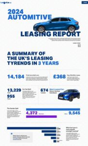
Infographics
We’ve all seen infographics before, and you may well have heard their virtues extolled when it comes to accessibility, readability, and shareability of content – and for good reason!
- 60% of businesses have used infographics in their content strategy.
- Readers are estimated to retain 65% of information on a page when it is paired with a relevant infographic.
- Users are 30 times more likely to initiate a payment when prompted by visuals than by text.
- Infographics can be processed by users 60 times faster than plain text.
- Nearly 37% of people click on the first link in an infographic.
Infographics can be used to take a piece of content to the next level. If you have a topic you’re looking to push, a frequently asked question (or set of questions) you want to answer quickly and easily online or work in a complicated sector that needs to be broken down for many users, an infographic might well be the way to go.

Additional design elements
We’re talking things like testimonial banners and boxes, comments and profiles of contributing experts, statistics, timelines and interactive elements!
All of these elements are fantastic for breaking up larger text elements without taking focused users out of their reading flow, and giving those just skimming a piece something to pick out and absorb quickly!
Why is design important for content?
Ultimately, content that is not well-designed rarely gets read.
Content that doesn’t get read isn’t going to rank (and it’s certainly not going to convert).
With search engines prioritising a positive user experience more than ever, content needs to be useful, which is why content design is only going to become more important as the value of that genuinely useful content goes up!
At the very heart of it, content design helps users find the content they need in the most natural way possible.
In eye-tracking studies, it’s been discovered that when we are skim-reading something online, our eyes move in an ‘F-shaped’ pattern. We pick up most of the top headings and first lines of new paragraphs but tend to trail off when it gets to the meat of the content.
Splitting up content into smaller sections and more manageable paragraphs helps get more of your content read, and pushes users to spend more time on your site as a result.
Of course, sometimes that’s not quite enough.
Even all the writing flair in the world can’t make some topics interesting enough to read every word, and many users are just looking for a specific answer when they first land on a webpage anyway!
That’s why blocks like images, graphics, testimonials, profiles, bulleted lists, numbered lists, visualised processes, videos, and hundreds of other elements are used to break things up, break things down, add more detail, take out the detail, give more context, take away the fluff and create a balanced, readable, engaging piece of content online.
What is the helpful content update and what does it mean for content design?
Google’s helpful content update really picked up steam towards the tail-end of 2022 and primarily looked to help rank genuinely useful content more highly and to penalise content that was historically created just to help a page rank.
In particular, Google (and other search engines!) are looking to make their system as user-friendly as possible. After all, success for Google is people using their search engine, and if a user’s search results aren’t usable, readable, digestible or relevant, they’ll stop using the platform!
With that in mind, it’s clear that content design isn’t just a flash in the pan. It’s something that is only going to get more important as updates similar to the helpful content update continue to roll out.
Google wants to reward content that has been written with the express purpose of helping people. The best way for content creators and website owners to do that is with content design.
To learn more about content creation, content design, helpful content update or the future of content in an AI world, get in touch with the team at Embryo.


