Conversion: The ultimate goal
The ultimate goal of every business’s website is to essentially convert visitors to the site into leads and customers. That being said, it’s often quite hard for designers, developers, or website project managers to know what changes to make to improve a site’s conversion rates, as there are so many variables that can affect the rate of conversion itself. The only way to know is to start testing and finding out what works.
It’s always difficult to know how changing one element of your site will affect your conversions until extensive split testing has been undertaken.
What is Conversion rate?
The conversion rate refers to the number of conversions divided by the total number of visitors. For example, if a business’ eCommerce site receives 800 visitors in a month and has 200 sales, the conversion rate would be 800 divided by 200, or 25%.
A conversion will refer to any desired action that you will want the user to take on your site. This can range from a click on a call-to-action button, to making a purchase and thus becoming a customer. Nowadays, most websites and apps will often have multiple conversion goals, and each will have its own conversion rate.
Tracking conversion rates across a site allows you to measure the performance of your web pages and/or apps. Understanding what percentage of your users are completing the goals that drive your businesses’ website allows you to gauge the success of your site/app and also enables them to identify any areas within the site that could be improved.
Improving the conversion rate of a site also allows for your site to attract more sales whilst maintaining the same amount of traffic. If you are spending £1,000 a month on advertising to drive 500 visitors to your site, if the conversion rate is doubled, then essentially the value of ad spend will be doubled. You will then be able to reduce your ad spend and achieve the same benefit as you were getting before, or invest the additional revenue into new ad programs.
The process of determining conversion goals, calculating their conversion rates, and optimising your site/app in an attempt to enhance conversion rates is known as “Conversion Rate Optimisation” or “CRO”. CRO is accomplished by cultivating hypotheses for why visitors are failing to convert and coming up with concepts for improving conversions. From here, the ideas are then tested through a process called A/B testing, in which two versions of the same page are tested against each other to see which one performs better.
By continually identifying new conversion goals, identifying areas where conversion rate can be enhanced, and executing tests based on new features, you can continuously improve the performance of your website/app.
What kind of web design converts?
When it comes to high-converting websites, most of these types of sites have a clean design – one that makes it easy for users to access the information they initially visited the site to gather. These sites often create a clear conversion path for their users to follow and ultimately convert.
The best converting websites have these things in common:
- Calls-to-action (CTAs) that stand-out
- CTA buttons help guide more leads towards conversion.
- Website visitors often convert best when the user journey is simple and they are aware of what it is that they should do on the site. That’s why high converting websites make use of calls-to-action (CTAs).
- The best converting websites display their CTA buttons within the first fold of the website and as such, give visitors plenty of opportunities to convert.
- Intuitive web design
- A business’s website is the first impression its audience gets from said business. The best websites that convert will take advantage of their intuitive, attractive web design in order to pull potential customers in and get them to explore their site, with the goal to get them to convert and become customers. Engaging web design for high-converting websites means:
- Responsive design
- Ease of navigation
- Highly-engaging website layout
- A business’s website is the first impression its audience gets from said business. The best websites that convert will take advantage of their intuitive, attractive web design in order to pull potential customers in and get them to explore their site, with the goal to get them to convert and become customers. Engaging web design for high-converting websites means:
Examples of high-converting websites and landing pages:
Ultimately, websites that convert simply manage to persuade their visitors to become customers. As a Website Project Manager, I’m always interested in seeing the latest features that some websites use in order to drive more revenue, so I have compiled this list of examples of websites and landing pages that convert as inspiration:
1. Airbnb
Why This Website Converts:
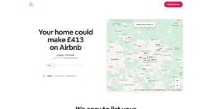
- Personalised approach – Airbnb shows the visitor right from the off just what they could potentially earn based on their area and the size of their home. This is useful for potential new hosts who may still be figuring out how much they should charge and what they can expect to earn, thus providing them with the information they may have initially visited the site for.
- Encourages community – Further down on the page, those curious about hosting have the option to contact a seasoned Superhost to answer any questions they may have.
2. Lyft – Driver Application Landing Page
Why This Website Converts:
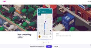
- Minimalist Design – There are no unnecessary distractions to take the user’s attention away from the page goal.
- Simple Form – The signup form is simple and includes only 1 form field, increasing the chances of successful registration.
- Images – The uncomplicated image creates an emotional response in users, reaffirming why they’re taking action.
- CTA – The CTA button is highlighted with the action Lyft wants you to take. The less desired action to the right of the main CTA is less noticeable.
3. Mailchimp
Why This Website Converts:
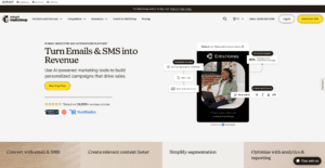
- Alluring web design – This elegant web design successfully simplifies a topic in a very overpopulated field. Coupled with fast loading and mobile responsive pages, it’s easy to get information fast. Additionally, a healthy amount of white space, as well as sleek infographics, lead to this particular site being a treat to visit.
- Simple Form – The chances of successful conversion are boosted dramatically due to the simplicity of the starter form.
- CTA – The CTA buttons are relevantly placed, ensuring they are in visible places throughout their site. While contrasting nicely with their overall quite harsh Yellow-Black colour scheme.
Conclusion
A well-optimised website or landing page can transform prospective customers into leads by gathering data that can help you better understand, market to, and impress your website’s visitors. Since landing pages are crucial for conversions, it’s important to make sure they’re well-designed, laid out, and executed.
Conversion rate optimisation and creating sites that convert is a very exhaustive science due to the fact that there are of course so many different possible changes that can be made. That being said, it will always be difficult to draw sweeping conclusions since different audiences will respond in different ways to the same changes that are made on any one website. While the above examples illustrate some of the tweaks that businesses can make to lift their conversions, finding the winning combination for your particular visitors is ultimately subjective depending on a businesses’ conversion goals.
Overall, landing pages help to grow your customer base and increase conversions across your site. If you’d like us at Embryo to create a page that delights customers with a user interface so great, they continue to come back for more, by all means, get in touch with us.


