In this blog, we explore 10 great banner ads examples and identify key factors which make them so great. As a Manchester-based content marketing company, we pride ourselves on producing compelling content – but that isn’t only restricted to content creation.
Strategic SEO efforts can empower a website and help your business cut through the market. At Embryo we use our insight to identify opportunities and build award-winning digital marketing strategies that bring in traffic and get your website ranking.
We take banner ads seriously and it forms an important part of our digital marketing strategy. To learn more about that strategy feel free to get in touch with our team after you’ve read this blog by phone at 0161 327 2635 or email info@embryo.com.
What Is Banner Advertising?
Banner advertising is a form of affiliate marketing – which is one business website hosting another business presence for marketing purposes. Banner advertising is a part of PPC (or Pay-per-click) marketing and consists of placing a designed ad on another website.
The ad is typically a long rectangle, either horizontal or vertical at the top or bottom of a website next to the main content.
A banner ad allows website owners to sell advertising space, but instead of being on a motorway or building like a billboard or bulletin board, they accommodate digital advertising space on a website instead.
While some website owners sell ads directly, most contract with advertising services that create the ads, decide how much to charge, and then display them on a website.
Banner ads serve two main purposes; impressions and click-throughs.
Impressions refer to how many people actually see your banner. While these people may not actually click over to your website, impressions still benefit the business because they serve to increase brand awareness.
With click-throughs, your goal is to get people to click through to your website or to a landing page. This action can generate leads, capture email sign-ups, make sales, or fulfil another engagement goal.
10 Examples of Great Banner Advertising
Below is a list of 10 banner adverts you might come across when you’re browsing the internet. Embryo is here to shine a light on what makes each one effective.
1. Dyson – Social Proof
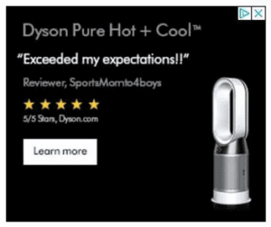 Dyson advertising is known for commentary on performance, often discussing the incredible design of their products and suction and why their product is so good. Their product design is also eye-catching and extremely recognisable worldwide.
Here, their product imagery is eye-catching against a black background, reinforced by social proof such as customer reviews as well as a 5-star rating, further serving to entice a viewer and encourage them to click and convert.
Banner ads have limited space, so every word must count – This method conserves space, delivers information in a concise way and keeps copy concise and to the point.
2. Hermes – Less Is More
 With a bigger brand and more clout comes the freedom to lose certain information a smaller brand may need to prioritise, instead allowing more freedom of expression.
In this case, Hermes as a well-known luxury brand doesn’t need to emphasise the price of the featured bag, but can instead pivot in a completely different direction, give no details, evoke a sense of adventure and mystery in their audience with a background of the aurora borealis and a tagline which gives nothing away.
Purchasers of Hermes are already aware of the kinds of price tags to expect. Instead here the reader is greeted by a moody, mysterious palette and a tagline that raises questions instead of providing answers.
3. ClickUp – Results-Driven Stats
Pleasing use of brand colours and a bold results-based statement to draw a viewer’s attention. In this instance, the results aren’t just business-based performance stats or something abstract and far removed from the visitor – the copy positions the data to be of value to others by making the world more productive.
4. Manscaped – Tongue-in-Cheek Humour and Design
 When it comes to banner ads, first impressions are everything. The visual impact of your ad is what grabs the viewer’s attention and piques their interest. Great banner ads are visually stunning, yet concise and focused.
Even better if the banner conveys important information- while not a true infographic, if the banner ad is both striking and incorporates data that demonstrates its value to an audience in a succinct and interesting way, it’s a strong way to quickly attract interest.
An example of strong visual elements would be Manscaped. Using imaginative and evocative in-house photography, clever and humorous use of assets, and an engaging yet simple copy style, this attractive banner ad loops an audience in. It provides an excellent opportunity to convert, encouraging traffic, clickthroughs, signups and other relevant calls to action.
Manscaped plays upon a tongue-in-cheek humour for the human element sure to draw attention, using intelligent, punchy copy paired with humorous euphemisms to lodge themselves in a visitor’s head.
5. Coca Cola – Seasonal Highs
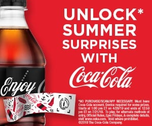
Even better if your banner ad caters to a particular season or changes with the time of year. As an example, Coca-Cola as a seasonal paid ad gains more relevancy around summertime thanks to the refreshing beverage being an iconic and sought-after favourite during the summer heat.
Coca-Cola is also famous around Christmas time thanks to the renown of the Coca-Cola truck, the television advert which plays upon festive nostalgia and the general merriment of the time of year. Playing upon these helps the brand feel tailored to the time or year and your particular needs and desires which also shift with the seasons.
6. The Ridge – A Clear Comparison
A comparison shown here plays upon a customer’s pain point of having a bulky wallet that takes up too much space and gets in the way. More importantly, it draws a comparison to a possible competitor and showcases its value in a way that is impossible to deny. If your product plainly demonstrates its quality, shape or design and speaks for itself, it’s essential for a business to capitalise on this.
7. Apple – Recognisable and Relatable
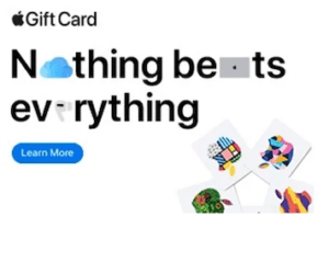 In this example, Apple’s use of icons endears them to their target audience in a fast and effective way by playing on a key form of modern communication – emojis.
This humanises and adds personality to the advert, making the audience members feel like it is communicating with them in the same way they might communicate with each other.
It also subtly pushes recognisable brand products and icons (iPad, AirPods, iCloud), as well as drawing attention to the copy in the advert.
One simple message with multiple reasons for why it’s effective.
8. LinkedIn – The Human Element

This LinkedIn banner ad is a demonstration of getting as much value out of a banner ad as possible, featuring a testimonial demonstrating its helpfulness.
Using pleasant colours and photography, instead of featuring something inanimate or impersonal, the ad features people making the content more relatable and relevant.
The call to action is clear and enticing and the viewer isn’t overwhelmed with too much information.
As a bonus, the quote forces the reader to use the word ‘me’ when digesting the ad.
9. Disney – Colour and Clout
Essential for catching the eye of the audience, striking graphic design elements are making the best use of a banner ad, incorporating eye-catching visuals and making the content look excellent on a web page, improving its ability to lure in clicks. A good example of this is Disney+. A wide variety of shows on the viewing platform allows for a wide variety of punchy visuals to further empower an already globally recognised brand.

10. Nike – Let the Product Speak for Itself
For a renowned brand like Nike, their marketing efforts can be propped up almost entirely by the product. Know what to expect with a shoe from Nike, so an easy-to-understand ad, a clear product image accompanied by basic information and a clear call to action can be all it takes for an audience member to convert.
Looking To Energise Your Website with a Banner Ad or PPC strategy?
Banner ads are a dynamic and ever-evolving field, so staying up to date with the latest trends and technologies is a good idea. By continuously refining your banner ad strategies, you can maximise your advertising ROI and keep your brand competitive when occupying banner ad space.
At Embryo, we have access to a broad variety of software that SEO strategies for our clients. If you want to learn more about these web design tools and how we can use them to optimise your website, don’t hesitate to get in touch with our team today by phone at 0161 327 2653 or email info@embryo.com.
