
Parkingeye
Who are Parkingeye?
One of the UK’s leading car park management companies, helping businesses and parking sites to improve profitability and provide an exceptional customer experience through a variety of creative solutions.
What Parkingeye wanted
Parkingeye needed an update to their existing website that could act as a hub for both B2B and B2C audiences. As Parkingeye work with commercial partners to improve the processes and profitability of car parks and parking facilities nationwide, they needed a site that clearly showed potential clients their expertise in this field and the services they offer. However, Parkingeye also works on behalf of their clients to issue and enforce parking charges when required, so having a user-friendly, customer-focused portal that could cater to B2C users was also vital for this project.
The client wanted to improve the user experience for both of their customer segments, resulting in an improved conversion rate from their B2B customers and a streamlined user journey to reduce pollution from the B2C side of the business.
Parkingeye needed an update to their existing website that could act as a hub for both B2B and B2C audiences. As Parkingeye work with commercial partners to improve the processes and profitability of car parks and parking facilities nationwide, they needed a site that clearly showed potential clients their expertise in this field and the services they offer. However, Parkingeye also works on behalf of their clients to issue and enforce parking charges when required, so having a user-friendly, customer-focused portal that could cater to B2C users was also vital for this project.
The client wanted to improve the user experience for both of their customer segments, resulting in an improved conversion rate from their B2B customers, and a streamlined user journey to reduce pollution from the B2C side of the business.


What we did
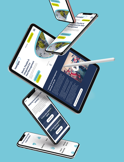
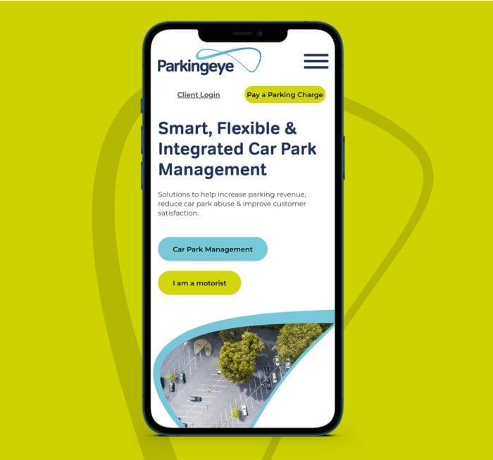
First, we created homepage designs that were clear and accessible to both B2B and B2C customer bases, and then two separate sites that branched off from there. This helped to separate these two audiences and streamline the user process for both parties. Not only is the new site easier to navigate for businesses and customers, but it also helps to prevent crossovers in traffic and mix-ups from site users enquiring about the wrong services.
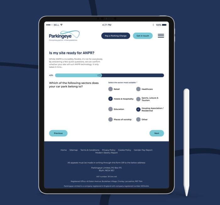
The business-focused side of the site gives users an overview of the services Parkingeye has to offer and how they can be implemented for a wide range of customers, as well as a custom step-by-step form that takes users to the next step of the sales funnel. It also houses the knowledge hub, where guides, blogs, downloads and FAQs created by Parkingeye are easily accessible to potential and existing business clients.
The customer-focused side of the site allows individual users to pay parking fines and make appeals easily and efficiently, without having to navigate through the company’s B2B offering. This streamlined process means improved compliance and a better customer experience overall.
Our development team developed a custom page builder, which includes a variety of different content blocks so that going forward the client has full control of their site, and is able to edit website pages and create new pages with ease, and without the need for further input from a developer. This makes it easy for Parkingeye to create landing pages for marketing campaigns as and when they need them.
Ready to see similar results?
If you’re ready to get smarter about your digital marketing strategy, let’s talk. Start your growth story with Embryo.


