Summer is a prime time for brands to be as creative as possible with their campaigns, drawing on the fact that people are outdoors, travelling and much more open to sharing moments and experiences with others.
The Brazilian Amazon Branding
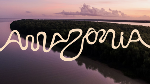
One of the most popular things to do in summer is travel, so destinations are having to stand out more than ever in this period. For the first time, the Brazilian Amazon has launched its official destination ‘living brand’ in order to increase tourism as well as opportunities for the local community. The logo is built from unique features of the river as it winds through nine states, its bends and tributaries forming the letters of the alphabet. I think it’s such a beautiful idea for the identity to be built entirely from the landscape itself, making sure to position the river at the forefront of the whole project.
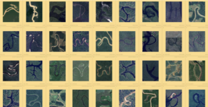
Created by FutureBrand São Paulo for RAI (Integrated Amazon Routes) in partnership with Embratur (Brazil’s tourism board), the vibrant and playful identity gives the river a platform for the first time, allowing the real beauty, culture and wildlife that is so attractive to everyone to be more accessible and inviting. The result is hopefully to create more depth to the location, not only being seen as a holiday destination but as a hub for culture, craftsmanship, biodiversity and a location that is beloved by many communities, flora and fauna.
Columbia: HikeFest
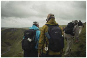
If the Brazilian Amazon is about giving travellers a reason to explore, Columbia is about making sure they actually get off the sofa and do it this summer. HikeFest by Columbia is billed as the ‘UK’s most remote gig’ and is in its third year of running. The attendees this year were given the coordinates and guided by the Columbia Hike Society leaders across the Peak District. The route being off-road and the destination being a cave ensured that people stayed relatively offline and present, as well as blending people’s love for music, the outdoors and community, for the new generation of hikers, encouraging them to ‘get lost in the music’.
Having a rave in a cave is a lovely brand activation campaign for Columbia, allowing them to be in the centre of their own ecosystem and engaging with the people who wear and use their products every time they explore, grow and adventure. London-based producer Duskus is well known for his music, which is inspired by the outdoors, so he was the perfect fit for headlining one of the cave raves this summer. He’s got tracks in his catalogue with artists such as Fred Again, Four Tet and Skrillex, which meant his headline slot alone was enough to generate a buzz for the event.
Yeti: Four Letters
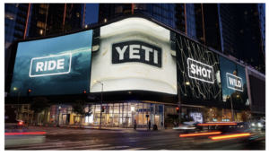
Yeti takes a similar ‘your passions, not our product’ approach, but instead of building an experience like Columbia’s, it hands its own logo over to the people who wear it, with its ‘Four Letters’ campaign this summer. Throughout the years, Yeti has grown from being just an outdoor goods retailer to an adventure must-have, expanding from roots in fishing to swimming, skateboarding and so much more. The campaign is in collaboration with Wieden+Kennedy and sees the bold, well-known Yeti logo being replaced with other four-letter words such as ‘SWIM’, ‘FISH’, ‘WILD’, ‘GOAL’ all written in the brand font. Using such a wide range of words helps fully encapsulate the customer base, showing its breadth and reach across so many different hobbies, which in turn lets so many people see themselves in the brand.
The photography and videography used in the campaign, paired with the bold typeface, is beautifully emotive, really adding context and real-world experiences that people have with Yeti. The OOH adverts are up in big cities and at this summer’s major sporting events such as the World Cup to even further push its reach to its intended audience.
IKEA Canada: Assemble the World
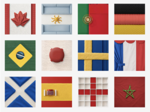
Where Yeti leans on sport and outdoor pursuits to earn its summer relevance, IKEA goes straight for the moments everyone’s already talking about…the World Cup. IKEA Canada’s ‘Assemble the World’ campaign created by Dentsu Canada sees 18 national flags crafted from common IKEA products such as towels, outdoor tables, candles and soft toys, turning everyday homewear into storytelling that everyone can recognise. We all probably have a bit of the World Cup in our homes this football season.
National pride is something many of us can relate to when watching the World Cup, wanting to meet up with friends and have summer socials, so IKEA are placing itself within it. Providing the table you sit at when you’ve got friends over, the towels you use after going for a wild summer swim and the glasses you toast when your team scores the winning goal.
Polaroid: The best of summer is analogue
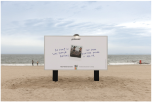
IKEA’s flags get people looking outward and cheering for their team, whereas Polaroid’s closing message asks them to put the phone down and look up instead this summer. Polaroid’s ‘The best of summer is analog’ campaign is highlighting data centres’ use of water consumption, urging people to stop staring at a screen and ‘Go jump in some water before the data centres drink it all up’, to engage with the world and to make memories. You can then capture on the new generation of camera polaroid has released, as well as sparking conversations about real-world experiences away from technology.
The main billboard being located on Coney Island beach makes the overall message hit harder as the beach is as far from a screen as you can get. It also gives the people who are actually seeing it the pride of knowing they’re one of the few. But to extend its reach, the campaign is also being shown OOH around New York, South Korea and London. The messaging used is allowing and encouraging you to be carefree and links back to Polaroid’s brand values, which are solidified by their creative director Patricia Varella who said: “we’re deeply pro-human”. The photography used in the campaign is very tender, genuine and relatable, showing people kissing, running into the sea, and being out in nature. Getting out this summer can be extremely easy.
It seems the brands winning this summer are the ones telling stories with real moments, real places, real people. In a world surrounded by AI, we are craving something a bit more human.