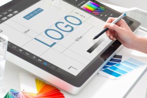
One of the most significant visual components of a brand is its logo. Within seconds of a visitor coming to a site or entering a store, it is responsible for initiating brand awareness and communicating brand identity.
However, the logo design industry is changing. Brands are beginning to recognise the significance of logo design, and many have begun to invest more in logo design in recent years.
So, with all of this new focus on logo design, how can you ensure that your logo is innovative and helps you stay ahead of the competition? At Embryo, we take your branding and the creative process very seriously and it forms an important part of our digital marketing strategy. To learn more about that strategy feel free to get in touch with our team after you’ve read this blog by phone at 0161 327 2635 or email info@embryo.com.
Stats, Facts, and Information about Logos

Consumers will be most receptive to a company’s brand identity, which often “resides” in a logo. Having a distinct design allows your customers to recognise your brand even if it changes over time, as many businesses did during the COVID-19 epidemic. This is why, whether your company is huge or little, having the appropriate logo design is critical.
We’ve compiled some interesting facts, stats and data about logos, to provide vital branding information. Perhaps this data has some logo and graphic design suggestions you didn’t know you’d been looking for…
- 94% of the world’s top 100 brands use only one or two colours in their logos: Blue is the most popular colour used in business logos worldwide, followed by black and red. The least popular colour in logos is brown because people usually associate it with rotting or decay
- Roughly 40% of logos are designed without any text: A delineation-like logo is better suited to smaller screens, as more intricate designs may lead to logo readability being compromised on these devices
- As of 2021, the top-ranked company logos are Apple, Nike, Coca-Cola, Mercedes-Benz, and Adidas: Some of these are the cheapest logos in history, with the logos for Google, Coca-Cola, and Microsoft, all being created for free despite representing billion-dollar companies
- 6% of logos contain a hidden message or symbol: The FedEx logo contains a hidden arrow between the “E” and “x,” symbolizing speed and precision
- The average time spent by a viewer looking at a logo is 5 seconds
- A well-designed logo is associated with trustworthiness by 39% of people
- A brand’s logo is the most recognizable brand identifier. The other ways that consumers identify brands are by visual style (60%), brand color (45%), and unique voice (25%)
- Nowadays, 67% of small businesses are willing to pay over $500 for a logo
What Makes a Good Logo?
A good logo has three basic characteristics: it is simple, relevant to the company it represents, and instantly recognisable.
Other frequent features of a good logo include:
- Highly memorable
- Relevant over time
- Versatile
- Marketable
- Generally attractive
Most, if not all, of these characteristics, may be seen in the most successful logos throughout history.
- The Nike “swoosh” logo is worth an estimated $26 billion, was designed by Carolyn Davidson in 1971 and was initially purchased for only $35: The “swoosh” was designed to represent motion and speed, reflecting the brand’s focus on athletic performance.
- McDonald’s golden arches logo is recognized by 88% of the global population: One study in 2010 found that 69% of three-year-olds could recognize the McDonald’s logo
- It can take anywhere from a few minutes to a few weeks to design a logo.
Creating a Logo

On average, it takes professional designers around 10 to 20 hours to complete a logo.
- The Coca-Cola logo is written in a unique script known as the “Spencerian script”
- Logos with a unique font style are more likely to be remembered than those with common fonts
- The NBC peacock logo was created in 1956 to promote colour television
- The Adidas logo represents a mountain, symbolizing challenges and goals that can be overcome
- The IBM logo has maintained the same basic design since 1972: Redesigned by Paul Rand in 1972, it has remained virtually unchanged since then
- The Google logo has a rotated “e” to convey the company’s desire to think outside the box
- The Google logo uses the primary colours: red, blue, yellow, and green, representing playfulness and diversity
- The McDonald’s logo colours, red and yellow, are used to stimulate appetite and create a sense of urgency
- 72% of consumers prefer a logo that represents the product or service offered
- Logos that incorporate movement or dynamic elements can convey a sense of energy and innovation: A study found that consumers form a first impression of a logo within 10 seconds
- The first-ever logo trademark was registered by Bass Brewery in 1876.
- The average person is exposed to around 5,000 logos per day.
Logos on Social Media
Consumers are constantly bombarded with logos and branding, especially in the digital sphere, for example, when scrolling through social media.
- Logos with symmetrical designs are perceived as more attractive and memorable.
- 39% of people surveyed associate yellow with optimism and happiness in logo design.
- The Twitter logo was designed using 13 circles, representing connectivity and inclusivity.
- Logos featuring animals are more likely to be associated with trustworthiness and reliability.
- Companies that consistently use their logo across all marketing materials can increase revenue by up to 23%.
- The Toyota logo combines three overlapping ovals, representing the unification of the company, its customers, and the world.
- The BMW logo represents an aircraft propeller in motion, paying homage to the brand’s aviation history.
- The Mercedes-Benz logo, featuring a three-pointed star, symbolizes the brand’s dominance in land, sea, and air.
Conclusion: These Stats Unline the Importance of Logos For Your Brand

Logos are a critical component of a brand’s image. They serve as the company’s face and become synonymous with the brand among consumers. According to research, 75% of respondents recognised a firm simply based on its logo, a logo is the #1 identifier of a brand.
Furthermore, 42% of respondents feel that a brand’s entire personality can be deduced from its logo. This puts a lot of emphasis on a company’s logo to be exceptional and true to the brand.
Many elements influence a consumer’s decision to acquire a product or service from a certain brand, one of which is its recognisable logo. In one survey, for example, 73% of customers said they were more likely to trust and buy from a brand they recognised.
A terrible logo, on the other hand, might have a detrimental influence on a brand. According to one research, 60% of buyers will shun a brand if it has an unusual or unappealing logo.
Brands can benefit greatly from recognition. It may mean the difference between a brand becoming a household name and just falling into obscurity. Though it is obvious that a brand’s logo is essential, most small businesses have a set amount of money they are ready to pay for a logo.
While 67% of small firms are prepared to pay more than $500 for a logo, only 15% will pay more than $1,000. There is also a significant disparity in the cost paid for logos by prominent corporations.
Some of the most recognisable logos representing big corporations, such as Google, Microsoft, and Coca-Cola, were first made available for free. In comparison, the greatest money ever paid for a logo was $1,280,000,000 for the name Symantec’s name & Acquisition.
There are several variations and methods for a logo to be effective. Looking to start up your logo game, to create a logo that’ll resonate in customers’ minds in the long run? Let’s talk, and see how Embryo can help!
You can read more about our team, our values, and our case studies on the Embryo site.


