Branding trends. From 80s inspired neons to line drawing and scrawling, there are many branding fads that have come and gone over the years.
But one trend that seems to have stuck around is the process of ‘debranding’.
What is debranding?
In a broad sense, debranding refers to a marketing strategy whereby a company promotes its product without its name, often in an effort to appear less corporate.
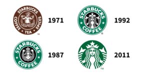
However, more specifically, the most common form of debranding in recent years has been stripping back to the bare bones of a logo, removing the company name and leaving only symbols behind. (For example, Starbucks removed its name from its coffee cup, just leaving the famous siren symbol.)

Image source The Branding Journal
These minimalist, flat logos have been on the rise for over a decade now, and it’s a craze that does not seem to be slowing down. Household names like Nike, Coca-Cola and Toyota have all jumped on the ‘less is more’ bandwagon, stripping their branding back. But just why is it that these brands are opting for simplicity in favour of more intricate, detailed logo designs?
Simplicity breeds confidence
One potential factor is the idea that simple branding creates a sense of confidence and trust from the consumer.
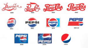
The logic in this is that a strong, minimalist logo design exudes a real sense of conviction; the brand is so recognisable, that you can take away key details and still know exactly who it represents. (Think of McDonalds omitting the ‘I’m loving it’ lyric from the iconic jingle in their TV ads; the whistle alone is memorable enough to spark a certain feeling in the viewer. The reputation speaks for itself.) The evolution of Pepsi’s logo is a great example of this.

Image source Zen Business
Catering to the rising demand for a digital presence
In a digital age, brands are also having to really consider readability when thinking about their branding. Logos need to be designed with both the smallest of 4k screens, as well as the biggest of roadside billboards in mind.
A simple, line-drawing-like logo is much better suited to a small device screen, as super intricate designs can often compromise readability on these devices, which would be off-putting to potential consumers. In order to ensure that their branding is future-proof, and appeals to the mobile first-viewer, it makes sense that these brands would opt for more minimalist designs.
Shrinking attention spans
Consumers are constantly bombarded with logos and branding, especially in the digital sphere, for example, when scrolling through social media.
Overly intricate and detailed logos can be frustrating to look at and take up too much time and effort to decipher. Digital consumers don’t have this time or desire to spare. They want branding that is easily digestible and quickly understood. With that in mind, minimalist logos appeal to the younger, digital-first generation who have ever-shrinking attention spans when it comes to traditional advertisements.
But can less become too much?
With all of the above in mind, it makes sense that many household brands are wanting to keep things simple. But can brands ever be too much when it comes to stripping things back?
Loss of memorability
Striking the balance between uniqueness and simplicity is essential. Brands can sometimes make the mistake of removing too much detail from their logos, leaving them with little substance, or anything that makes them stand out. There’s certainly a difference between keeping things clean and simple, and having a logo that lacks imagination or creativity!
Lack of brand message
Striving for a minimalist logo can also sometimes result in things being stripped back to such an extent that the logo doesn’t tell potential consumers anything at all about the company, or what it represents. Sometimes it can be worth adding in a few extra elements in order to clarify the brand and its purpose.
So, is less more?
With all of the above in mind, it seems that less IS more… but in the right circumstance. A simple, bare-bones branding style can be incredibly bold, striking, and truly effective; this is especially true if you’re a bigger brand, with a loyal consumer base that will recognise your brand in an instance. However, it is important that minimalism is approached cleverly in order to avoid having a logo that lacks creativity or substance.
Looking to start creating digital campaigns that grow your brand online? Let’s talk!
You can read more about our team, our values, and our case studies on the Embryo site.


