Here’s a fresh, designer-focused roundup of 10 standout creative campaigns that launched in the last two months, each one with a quick creative teardown, why it matters for digital, and a link so you can dive deeper into the work or the brand’s own release.
1) Bud Light – “Vendor Voices” (August 2025)

The work: Bud Light kicked off the U.S. college football season with a comedic short starring Shane Gillis. The idea is simple (and deeply relatable) the eternal struggle to flag down a stadium beer vendor, dialed up with Gillis’ delivery and a director’s eye for crowd choreography. The spot runs in :15 and :30 cuts across major U.S. broadcast partners and the brand’s social ecosystem.
Why it matters for digital designers: This is a nice study in single minded narrative: one joke, one need state, one product. The creative relies on blocking, framing, and typography lockups that read instantly in feed, proof that broadcast ideas can be engineered to fragment cleanly into Reels/TikTok cuts, cinemagraphs, and vertical promos without losing the gag. For brand systems folks: note how the team’s can packaging becomes an asset pack for social.
Link: Watch coverage and details on B&T (published Aug 22, 2025).
Source: B&T
2) Gap – “Better in Denim” ft. KATSEYE (August 19, 2025)

The work: Gap’s fall 2025 platform is a denim-first, Y2K nostalgia swing featuring global girl group KATSEYE moving to Kelis’ Milkshake. It lands as a 90 second hero film plus cutdowns, OOH including Times Square, in-store, email, and heavy social. It also dropped a limited edition hoodie with the group’s name created in Gap’s arch design.
Why it matters for digital designers: This is a masterclass in movement led brand worlds. Watch how the choreography maps to grid aware layouts, circular formations echo Gap’s “community” metaphor, while denim textures and cropped product macro shots become UI ready tiles. For motion designers, the choreography acts like a geometry system you can slice into verticals, story frames, and store LED ribbons without losing cohesion.
Link: Campaign write up at Marketing Dive (Aug 19, 2025).
Source: Marketing Dive
3) Naturium – “Every One, Every Where, Every Day” (August 18, 2025)

The work: Beauty brand Naturium rolled out its first ever brand campaign, a broad reach positioning play anchored in everyday rituals versus transformation tropes. The release outlines a multi channel plan across digital and social with creative aiming to normalise skincare as daily care rather than event level glam.
Why it matters for digital designers: The campaign’s design language leans into honest light, skin close shots, and restrained type, a visual stance that slices cleanly into PPC assets, retail displays, and UGC leaning social. For those building design assets: note how the brand treats texture and negative space as primary components; it’s a scalable approach for direct to consumer sites that need to feel editorial but remain commerce fast.
Links: Brand announcement/coverage via press (Aug 18, 2025) and Allure’s breakdown.
Sources: Beauty PackagingAInvest
4) Marc Jacobs – “JOY” (Fall 2025, launched late July)

The work: Marc Jacobs JOY introduced a new fragrance platform with a high gloss film and stills that telegraph the brand’s familiar tension: high quality minimalism and sly attitude. It’s a cinematic palette, stylish close ups, negative space, serif typography, that brands will be moodboarding all season.
Why it matters for digital designers: JOY’s art direction is a lesson in scale discipline. The campaign’s type sizing, thin rules, and generous white space hold up in micro contexts (think Instagram Story bars, mobile banners) without collapsing. Asset kits look built for shoppable video and quick turn editorial placements, a helpful reference if you’re designing modular creative that needs to feel expensive under retail timelines.
Links: Launch press details and fashion industry coverage.
Sources: Luxury DailyDSCENE
5) Dove – “Why2K” (Podcast-Led Brand Storytelling, July 2025)
 The work: Dove launched “Why2K,” a podcast designed to refract modern beauty culture through the lens of the early 2000s (think: the era that invented a lot of our current beauty anxieties). The series gives the brand ongoing storytelling outside of typical campaign boundaries.
Why it matters for digital designers: Audio first doesn’t mean visually forgettable. Dove’s system gives you a playbook for podcast native design: stunning art that reads at thumbnail sizes, waveform snippets for socials, and short caption led video pulls that become scroll stopping tiles without overproduced CGI. It’s a reminder that brand voice can live as sound while still generating a robust visual kit.
Links: Dove newsroom note and trade coverage.
Sources: Dove
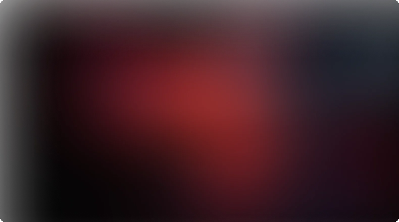
6) Häagen-Dazs – “Devoured” Minimalist OOH (July 22, 2025)

The work: Häagen-Dazs dropped minimalist billboards that show nothing but a lonely, logo stamped ice cream stick against an indulgent red background. No product shot, no copy. Just the after. It’s an ominous image, and that’s why it reads from a mile away.
Why it matters for digital designers: This is silence as strategy. The composition (singular object, central weight, confident negative space) scales from 48 sheet OOH to 1080×1920 verticals without redesign. In digital, the “already eaten” concept turns into tap to reveal or scroll driven reveals: you can animate crumbs, add a melt smear, or let the stick slide in frame, all while keeping the idea intact.
Link: Creative Bloq’s feature (July 22, 2025).
Source: Creative Bloq
7) STARRY – “100 Degrees, 100% Off” (July 24, 2025)

The work: Lemon lime soda STARRY launched a temperature-triggered promo: when any U.S. city hits 100°F, consumers get 100% off a 20oz STARRY via mobile wallet pass and cashback redemption. They backed it with OOH alerts and even auto dispensing vending machines in heat-prone markets.
Why it matters for digital designers: This is context-reactive design done right. The creative hinges on a utility object (the wallet pass), which means your UI/UX is the campaign. The system anticipates real time states and communicates clearly in tiny UI containers. It’s a blueprint for marrying promo mechanics, weather-based triggers, and snackable motion graphics.
Link: PepsiCo press release (July 24, 2025).
Source: PepsiCo
8) 7-Eleven – “Roll-Up & Refuel™” (July 10, 2025)

The work: 7-Eleven’s new multi-channel platform celebrates two subcultures, skaters by day, car enthusiasts by night, framing the store as a cultural pit stop. The media mix spans TV/radio, OOH, paid social, search/display, streaming audio/video, plus tie-ins with the 7Collection merch shop and a DGK capsule drop.
Why it matters for digital designers: It’s a lifestyle graph more than a campaign: a flexible photography and motion system that stitches skate/culture language into retail promos without feeling like ads. For asset makers, take notes on motion overlays (speed lines, deck POVs), hero product framing (Big Gulp®, Big Bite®), and a grid that tolerates chaos, perfect for creator collaborations you can’t fully predict.
Link: 7-Eleven press page (July 9/10, 2025).
Source: franchise.7-eleven.com
9) Goldfish – “Retrieval Service” Jersey Shore Pop-Up (July 2025)

The work: Goldfish staged a car wash stunt on the Jersey Shore with lifeguard flavored kitsch: an experiential “Retrieval Service” for beach lost Goldfish crackers, complete with brand uniforms, signage, and cheeky rescue vibes. It’s a beach day turned brand theater.
Why it matters for digital designers: Physical spaces are content engines. Goldfish’s signage system, oversized arrows, lifeguard reds, tongue and cheek copy, converts into vertical video and carousel stills effortlessly. If you’re designing wayfinding or temporary environments, study how the brand props double as photo ready set pieces that generate endless UGC.
Link: Campaign overview (July 25, 2025).
Source: lbbonline
10) Taco Bell × Bad Birdie – Junior Golf Capsule & Activation (July 17, 2025)

The work: Taco Bell teamed up with golf apparel brand Bad Birdie to drop a junior golf collection and on-course activations, leaning into the sport’s Gen-Z renaissance. The hook: golf, but make it spicy, colour blocked apparel, playful T-Bell iconography, and social native content from tee box POVs.
Why it matters for digital designers: It’s a case study in category collision, fast food x sport, where the visual system needs to reconcile brand equities from both sides. The designers built a shared colour grammar and a consistent icon rhythm (tacos, tees, swing arcs) that reads in lookbooks, shop grids, and TikTok loops without stepping on either brand’s toes. For collaborative work, this is how you create co-ownable assets.
Link: Activation/capsule coverage (July 17, 2025).
Source: tacobell
What these 10 campaigns have in common (and how to steal the good parts)
- One big, clear behavior. Whether it’s chasing a vendor, toggling a wallet pass, or staring at an empty ice cream stick, each campaign revolves around a visible human action. If you’re concepting for digital, design around moments your audience can perform (swipe, tap, watch, show up).
- Design systems that are formatted perfectly. The best work here anticipates cropping and format churn. Gap’s choreography works as nine grid posts; Häagen-Dazs’ stick centers perfectly in 9:16; Bud Light’s gag survives a GIF loop. Build your master comps with “break points” marked for cutdowns.
- Context-aware utility beats novelty. STARRY’s heat triggered freebie is marketing as real time service. Your next promo brief: can your creative logic react to context (location, weather, time) in a way that the UI itself becomes the creative?
- Audio strategies need visual systems. Dove shows that podcasts are a brand design channel, not just an RSS feed. Create a micro design kit for episodes: thumbnail rules, waveform blocks, subtitle style, CTA chips, and animation timings.
- Physical experiences are content farms. Goldfish and Taco Bell’s pop-ups prove that environmental design can be optimised for feed capture. Design props at human scale with clear contrast so they read in selfies and photo crowd shots.
- Collab logic is a grid, not a vibe. Taco Bell × Bad Birdie (and Gap × KATSEYE) succeeded because the shape language, color schemes, and type hierarchy were resolved early. When two brands meet, start with shared typography and a blended colour palette, then test it in 9:16 first.
Quick creative prompts you can steal for your next project
- Make the UI the hero. Design a promo that unlocks based on a real world trigger (weather, time, location). Build the state changes (locked to unlocked) into your social motion.
- Commit to one object. Try a product after image (like Häagen-Dazs’ empty stick). What remains after use? Make that your campaign symbol.
- Design a choreography grid. Start your motion board with formation diagrams, then generate static crops from those frames for socials and retail.
- Podcast as product. Build a micro system for audio: cover templates, waveform bars, lower third rules, and a 9:16 audiogram kit.
- Collab calculus. Map both brands’ type scales and palette overlaps. Lock a “shared” style that can survive creator remixes.
If you’re interested in our bespoke design services and want to transform your own creative marketing campaigns, get in touch with one of our team today.