Pillar pages examples are widely available these days, each claiming to know the secrets as to what makes a great pillar content page. But how do you know which approaches will actually get you results?
In this blog post, we are going to be analysing various examples of pillar pages so you know what works, what doesn’t, and what you should be including to improve that all-important user experience.
We know what you’re thinking – why should you listen to us? Well, Embryo is an award-winning independent search-first marketing agency. Our team of experts has a track record of incredible results thanks to strong strategies that achieve long-lasting results.
If you’re interested in finding out more about our SEO approach, feel free to get in touch by phone at 0161 327 2635 or email info@embryo.com.
First Things First, What Is a Pillar Page?
A pillar page serves as a central hub for a broad topic which links out to various pieces of content, also known as topic clusters.
These content clusters should go into further detail about the pillar page – sometimes referred to as the parent page or topic – to provide the user with a thorough understanding of the topic.
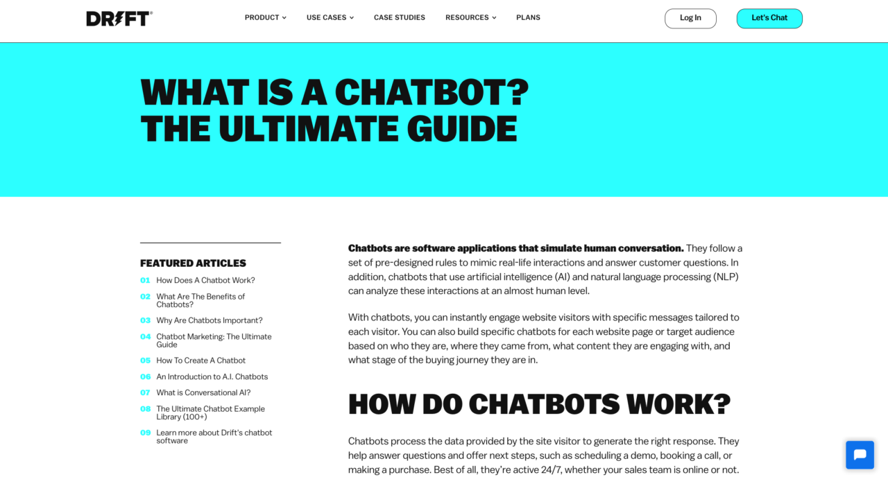
Let’s take a look at this example from Drift. As you can see, this pillar page is about Chatbots and provides a broad overview of the topic.

This is a great pillar page example as the long-form content is split up into various sections thanks to headers, bullet point formatting, and infographics to keep the reader engaged.
Plus, using a sidebar to house the topic cluster pieces that relate to this pillar page easily showcases topical authority and improves user experience by making things simple for the reader.
It also follows good practice as each of these cluster content pieces internally links back to the pillar page, which provides numerous benefits.
The Benefits of a Pillar Page
We understand that this approach to SEO may seem time consuming and long-winded, but this hard work comes with a heap of benefits. These include:
- Enhances user experience – We all know how Google is rewarding content that benefits people, and a topic cluster strategy with an excellent pillar page makes the user’s experience far more easier to navigate.
- Easier for the search engine to crawl – Not only are things simpler for the user, but also for the search engine to crawl the page and understand the page and its purpose.
- Builds topical authority – Topic cluster content should cover a wide range of subtopics for the parent pillar, which will help improve your site’s authority in regards to that particular topic.
- Rank for competitive keywords – The beauty of a pillar page is that you can aim for a broad keyword and the supporting clustering content pieces help build your topic authority, which in turn helps your ranking for the broad keyword.
- Improves internal linking – As each topic clustering piece links back to the pillar page, your internal linking strategy will naturally improve.
- Creates backlink opportunities – One way to think of a parent page is as a resource pillar and therefore, the opportunity for backlinks quickly opens up.
- Avoids keyword cannibalisation – We all know how easy it can be to fall into keyword cannibalisation, but with this style of strategy it is easy to keep track of the keywords you are aiming for to avoid this situation.
When combined, these benefits come together to not only increase your E-E-A-T rating – which is becoming ever-more important to Google – but also improve organic traffic and search rankings.
So, if you’re struggling to improve your SEO performance, you may benefit from this style of strategy.
A Great Pillar Page Example
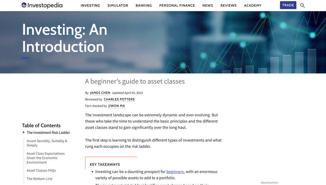
Let’s take a look at Investopedia’s Investing: An Introduction. This is a great pillar page example as it is clearly created for the user and has their search intent in mind.
From the title alone, the reader – and the search engine – is aware that this is likely to be a longer piece of content that will be a broad understanding of the topic.
The table of contents and key takeaways section allows the user to skip to specific sections if that is what they are looking for – all amounting to a great user experience.

Once you have reached the bottom of the article, users can easily see what is next to read or can scroll to find exactly what it is they are looking for.
Investopedia has created 42 pieces of content in this strategy. Now, you don’t always have to include so many pieces – in fact for some pillar pages it just is not possible.
However, what this does show is that there is usually scope to create numerous pieces of content that relate to – and support – your parent topic.

What Not to Do on a Pillar Page
You’ve finally created your pillar page as well as your cluster topics and… it isn’t performing quite like you’d hoped. Before you go thinking all that hard work was for nothing, there may just be a few simple fixes that can get your content to rank.
Your Content Is Overwhelming
Pillar pages tend to be long-form pieces and if you find your bounce rates are high, you may need to section the long-form content to make things more skimmable for the user. There are a number of ways you can do this, such as:
- Table of contents
- Various headings – H2s, H3s
- Bullet points
- Other content design – images, columns
Internal Links Aren’t Being Utilised Properly
A pillar page strategy works through the internal links between your parent page and topic cluster pieces. Now, you may be linking from your topic clustering content to the pillar page but are you linking to your topic cluster pieces from your pillar page?
If not, this may just be the reason you aren’t getting the results you expect from this content strategy.
Your Content Is Gated
A pillar page is part of an SEO strategy, so it should play by SEO rules. Therefore, if your pillar page is gated behind a form it’s no surprise it isn’t performing as you’d expected!
If you do need to obtain data and information from your users, try doing this from a different page to allow your pillar page to perform to its potential.
One Last Pillar Page Example
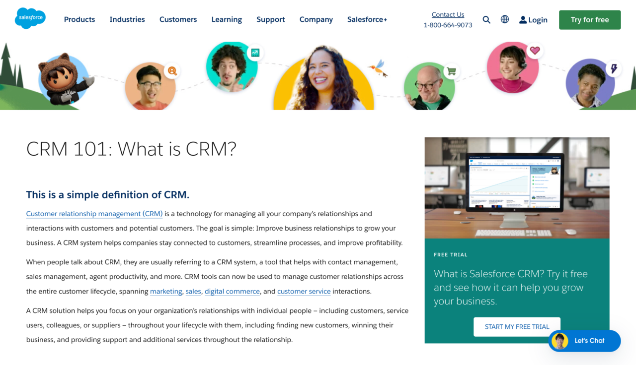
This example of What is CRM from Salesforce is a product or service-led pillar page. The content explores the basics of CRM (customer relationship management), who it is for, and why it is essential to business.

Unlike the previous examples we have shown, this pillar page aims to provide useful information to the reader and also convince them they need Salesforce’s CRM – which can be seen in the sidebar.
Although the intent may differ from previous examples, this is still a great pillar page example as it is still leaving the reader with useful information regarding a broad topic. The content is divided by various H2s and H3s, infographics, and includes links to other related content that may benefit the reader.
We have included this example to show you that even though the approach is the same, you can manipulate the pillar page and topic clustering strategy to suit the needs of your business.
For More Pillar Page Insights, Get in Touch Today
As you can see, creating a great pillar page is pretty simple, but there are a few tricks to know to ensure your parent page gets the results you expect. The benefits to this content marketing strategy speaks for themselves, and Embryo’s expert team can ensure these results continue for months to come!
If you want some more guidance about your strategy feel free to get in touch with our team either by phone at 0161 327 2635 or you can email info@embryo.com.


